Mark & Karen Meuser
Great Room with Faith Hope and Charity
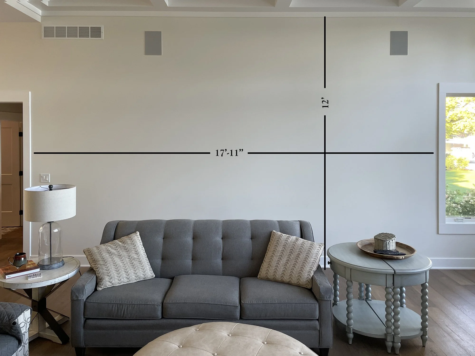
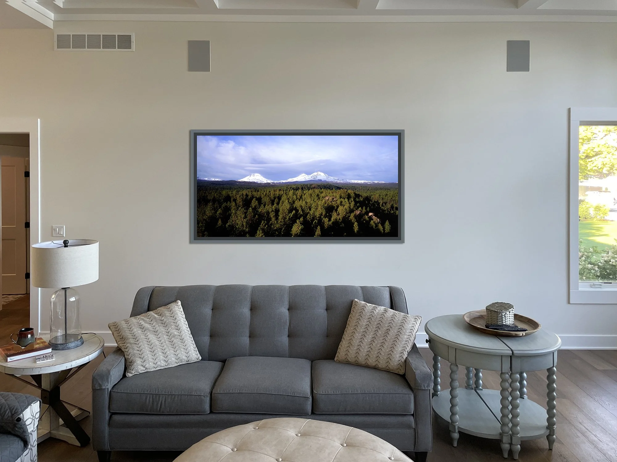
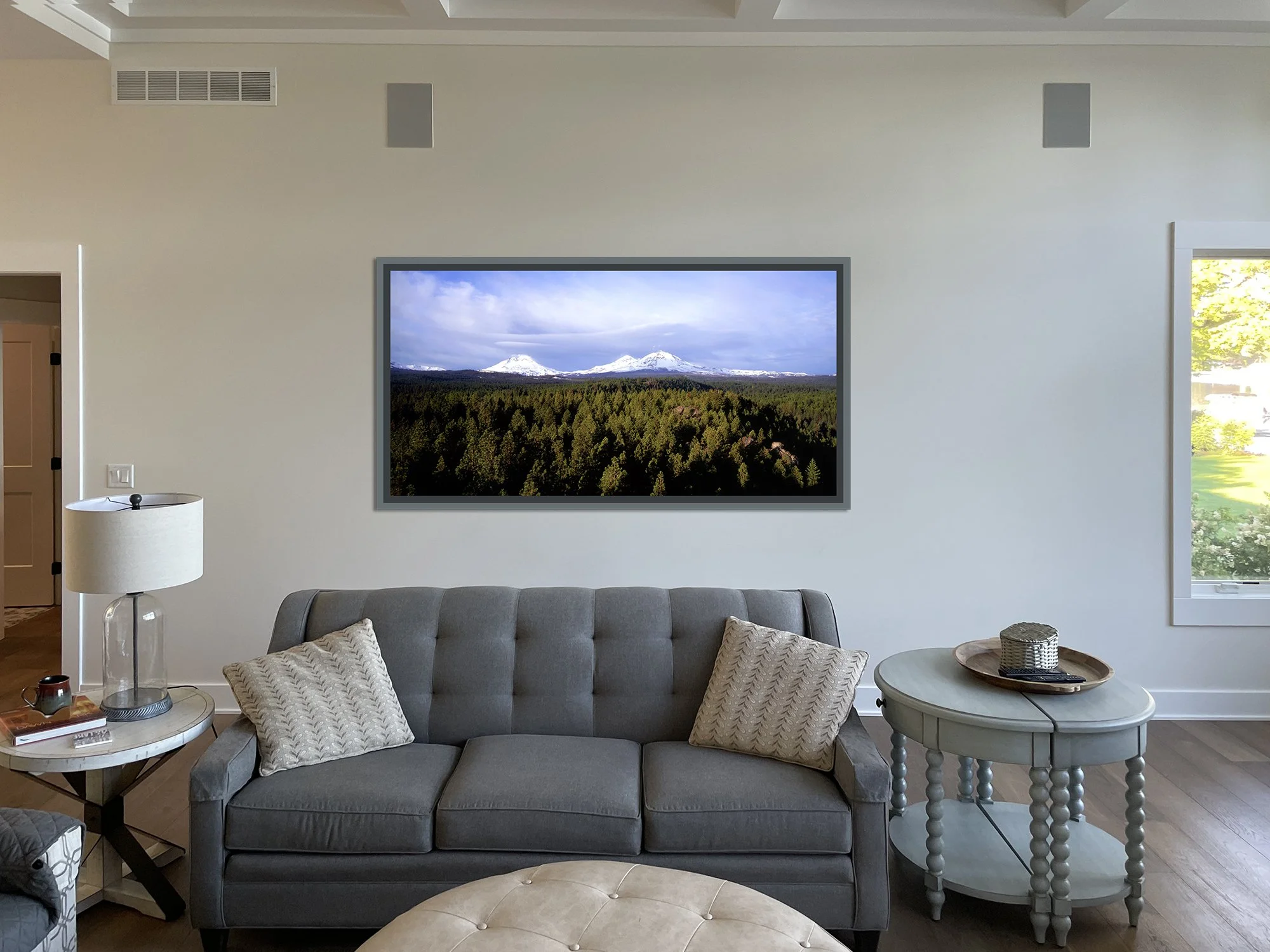
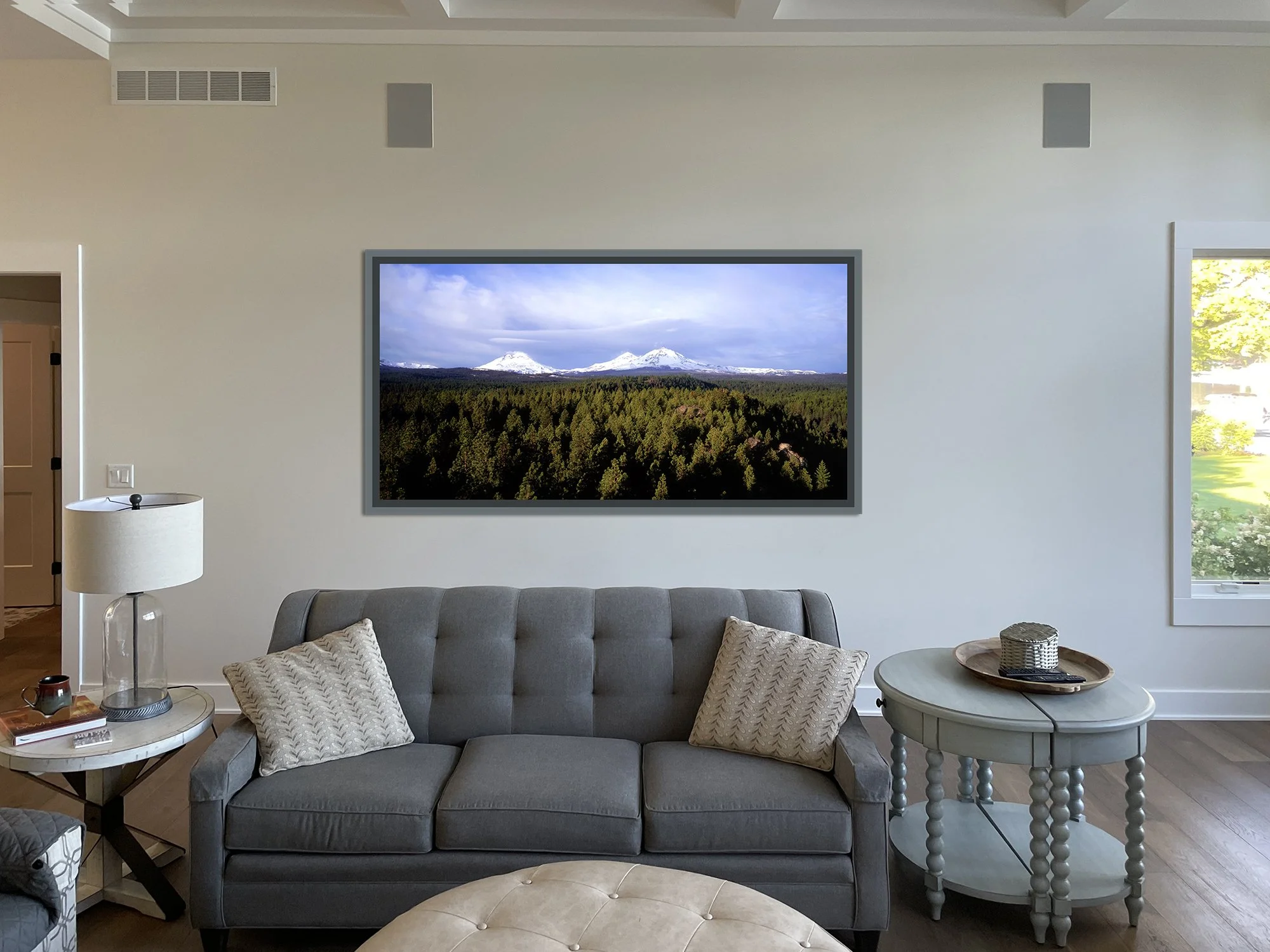
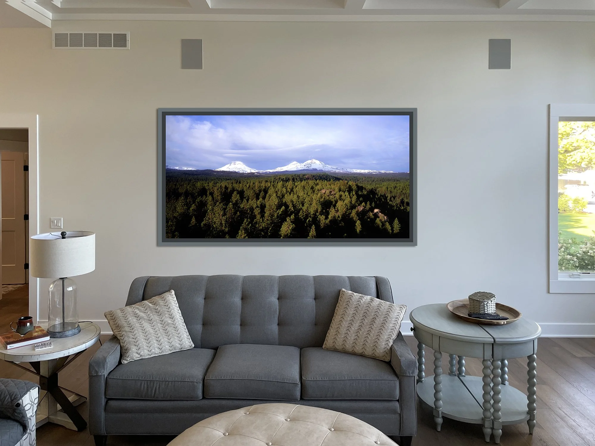
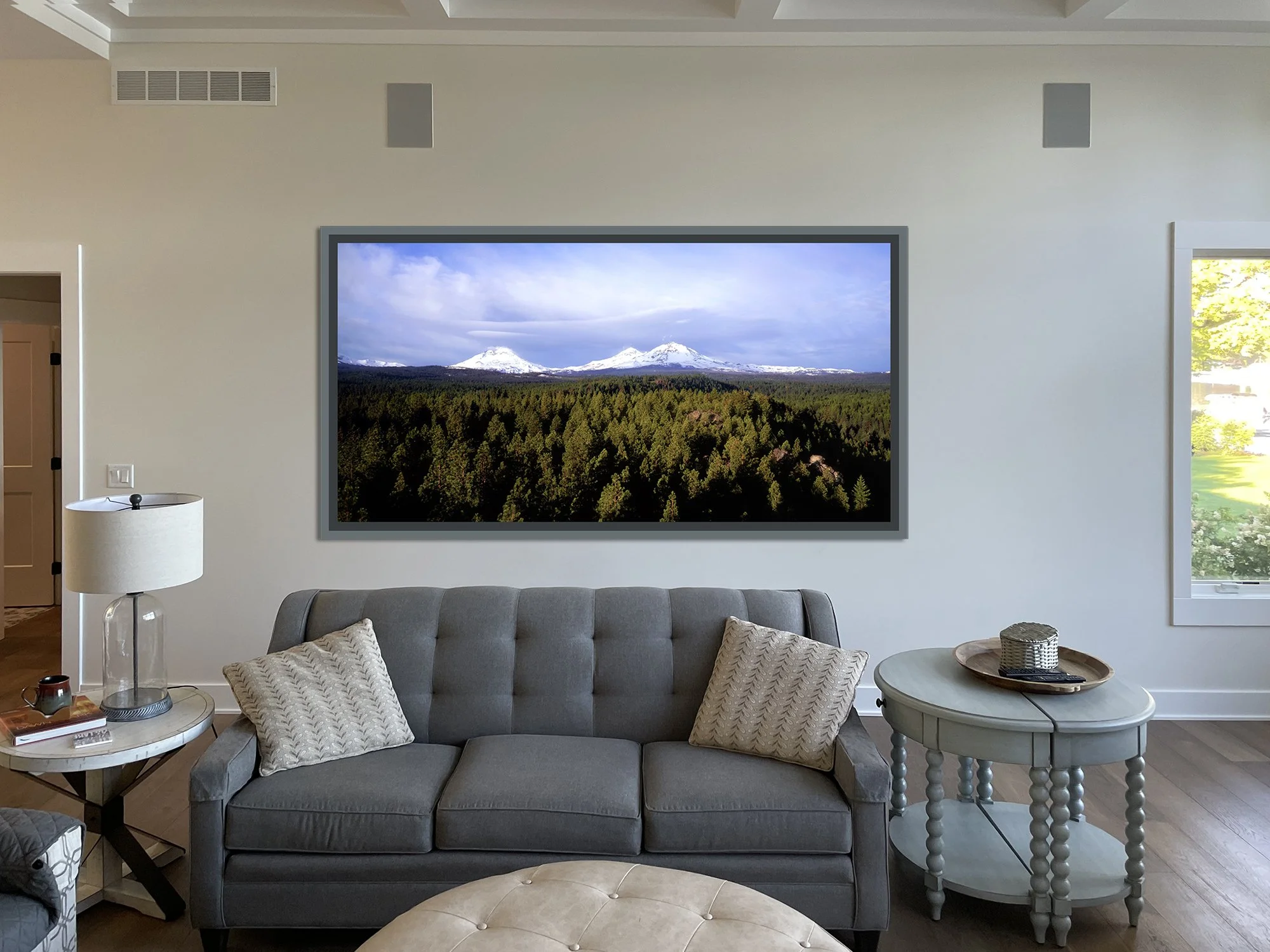
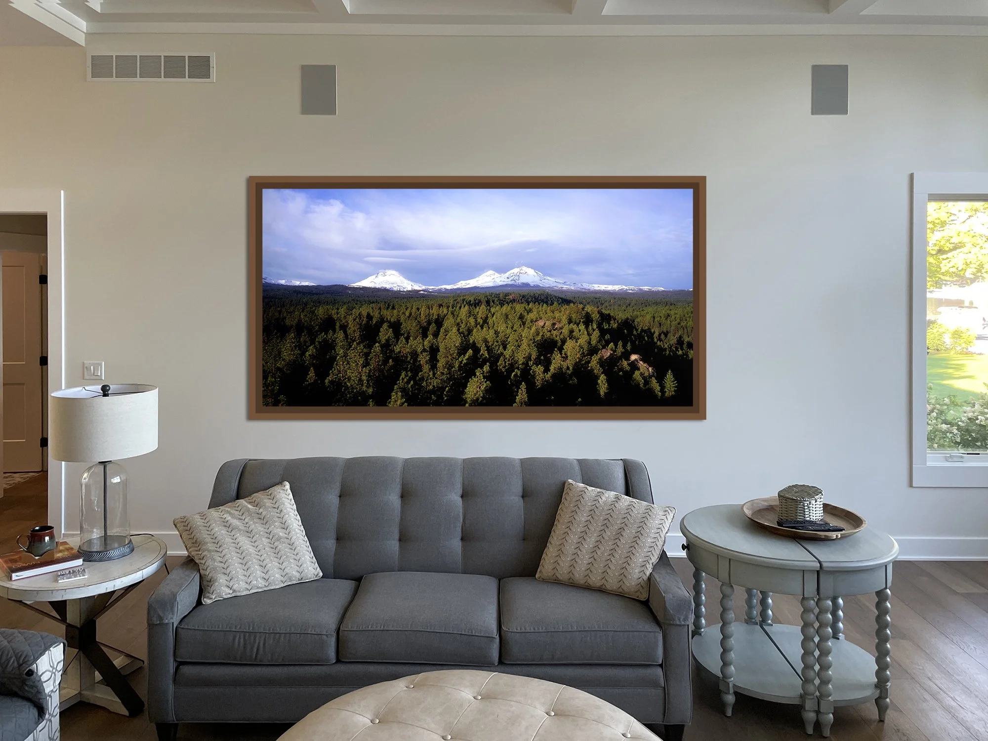
Below are a series of images based on the photo you sent of your Great Room. After correcting the perspective of the photo you supplied, for proper scale, I place several sizes of the Faith, Hope & Charity image by Gary Albertson. Each is represented in the kind of floater fram that we discussed. In the case of these images I chose a gray tone to the frame as it made more sense to me than a black or natural wood look. However, the last image in this series is a wood tone based on the hallway door. Another option would be to select a wood tone similar to the hallway door, or to pick up a complimentary tone from the stone fireplace wall.
The first image is to confirm that I understand the measurements you provided. The next 5 images are of different sizes so you can get a feel for what works best for you in this room. I noticed the the casing on the window in the corner and the casing on the hallway door frame are miss-matched, which causes a visual shift to the wall that can affect how the image looks on the wall based on size. The larger the image gets, the more you will notice this dissonance. The last image show here begins to push that boundary in my opinion.
Once you have a sense of the size the might work best for you, we can begin to work with accurate scale. These images are basically a gauge for you to respond to as far as the aesthetics of the room. I picked a relative center point on the wall that favors slightly more space to the right of the photograph due to the position of furnishings in the room. My sense is that this position would work best given what is currently in this space.